Bigger is better, right? While the classic adage is still up for debate, size is arguably the most effective way to emphasize visual elements. Simply put, larger elements draw greater attention than smaller elements.
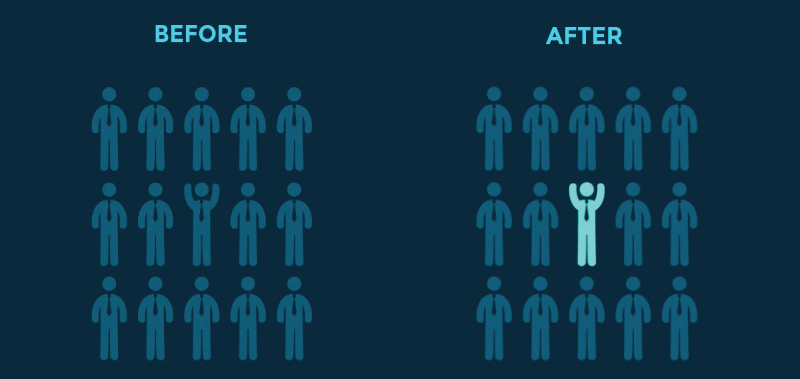
Just as larger elements are perceived as more important than smaller elements,bright colors usually draw greater attention than duller hues. For example,if a single sentence in a block of text is highlighted with a bright color, it immediately grabs readers’ attention.
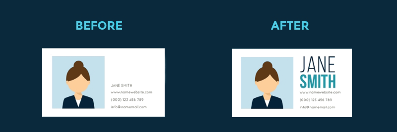
Typeface hierarchies can be created with text of various sizes, weights and spacing or a combination of each element. Even if a single font is used throughout a design, varying its size and weight not only draws attention to more importan telements, but creates an overall composition that is easy to read and understand.
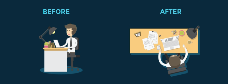
According to the Rule of Space, an aesthetically-pleasing design requires its fair share of clutter-free negative space, often referred to as “white space,”regardless of the design’s actual background color.

Proximity, or where elements appear in relation to one another, is one of the most basic elements of composition. Simply speaking, placing related elements close together suggests to readers that they are, in fact, related.

Just as grouping items near each other suggests their relation, including white space around elements singles them out as separate groups of information.Negative, empty space not only makes information easier for readers to digest by grouping it into compartments, but it also creates focus as it helps eyes zero in on individual items.

Alignment is part of the structure by which elements are placed in a design.It dictates that visual components, whether they be text or images, are not positioned arbitrarily throughout a composition.
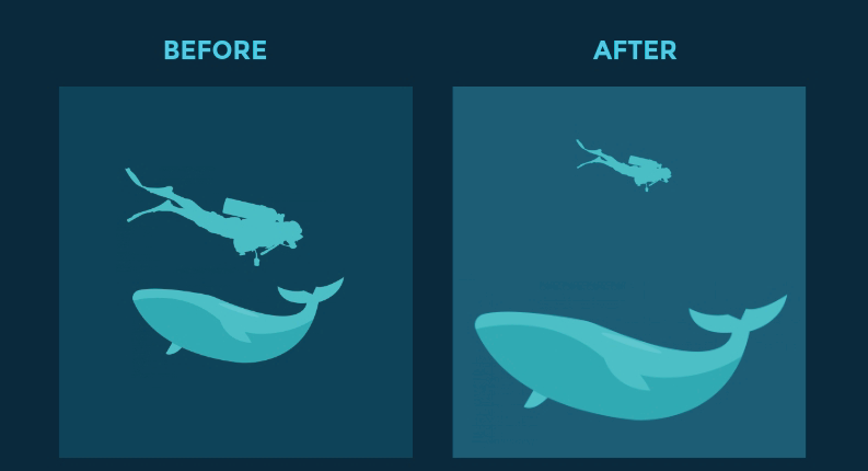
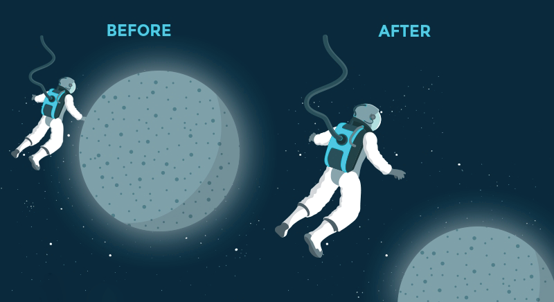
By utilizing perspective, designers can create an illusion of depth ranging from a few inches to several miles. Because we see similar illusions in the real world,we generally perceive larger objects as being closer than similar smaller objects and, therefore, they usually command attention before any other object on a page.