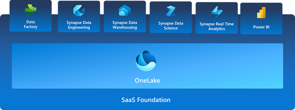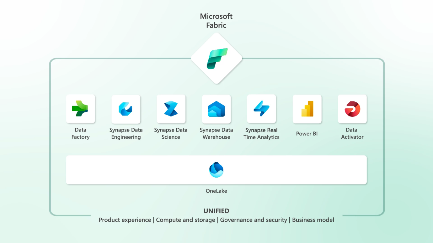
Here, we dive deep into the game-changing capabilities of Microsoft Fabric. The best way to understand Fabric is to understand its primary purpose, Fabric is an inclusive analytics product that prioritizes the needs of users and brings together an organization's data and analytics in a centralized hub. It combines the strengths of Microsoft Power BI, Azure Synapse, and Azure Data Factory, delivering a unified software as a service (SaaS) platform.
Fabric promotes collaboration among data engineers, data warehousing professionals, data scientists, data analysts, and business users, fostering a cohesive data culture within the organization.
Microsoft Fabric is a design language developed by Microsoft to create consistent and visually appealing user interfaces across various platforms and applications. It provides a comprehensive set of design guidelines, principles, and components that enable developers to build cohesive and engaging experiences.
In the context of Power BI, Microsoft Fabric helps create a unified look and feel across reports and dashboards, enhancing user experience and facilitating better data comprehension.
In this blog post, we will delve into the intricacies of Microsoft Fabric in Power BI, exploring its features, benefits, and how it can empower organizations to make data-driven decisions like never before.
Fabric in Power BI
In the ever-evolving world of business intelligence, Microsoft Power BI continues to lead the way with its powerful features and intuitive user interface. Among the many tools and capabilities offered by Power BI, one that stands out is Microsoft Fabric. This revolutionary technology has transformed the way users interact with their data, providing a seamless and immersive experience.
Key Features and Benefits
Consistent Design Language
Microsoft Fabric ensures a consistent and standardized design language across Power BI visuals, making it easier for users to navigate and understand the interface. With a uniform appearance, users can quickly grasp the purpose and functionality of different elements, leading to improved usability.
Responsive Layouts
Power BI reports built with Microsoft Fabric automatically adapt to different screen sizes and orientations, ensuring optimal user experience on desktops, tablets, and mobile devices. This responsiveness enables users to consume data insights conveniently, regardless of their preferred device.
Interactive Visualizations
Microsoft Fabric offers a wide range of interactive visual components that can be seamlessly integrated into Power BI reports. These components include buttons, dropdowns, checkboxes, sliders, and more, allowing users to interact with the data, filter results, and drill down for deeper insights.
Advanced Formatting Options
With Microsoft Fabric, Power BI authors have access to an extensive set of formatting options, enabling them to customize the appearance of visuals and reports. From font styles and colours to backgrounds and borders, these formatting capabilities empower authors to create visually stunning and impactful data presentations.
Accessibility and Localization
Microsoft Fabric places a strong emphasis on accessibility and localization, ensuring that Power BI reports can be accessed by users with diverse needs and preferences. The design language supports assistive technologies, adheres to accessibility standards, and enables easy localization for global audiences.
To view an image in a browser, hold the "Ctrl" key and click on the image.